Python在Spark上的机器学习(四)之可视化工具的介绍与PySpark的结合使用示例
前言
在Python和Java的生态圈中,有许多可用的可视化库,但是在这篇文章中,我们主要来介绍一下matplotlib 和 Bokeh的使用。
首先,这两个库都是Anaconda预装的。如果你是通过Anaconda来搭建的Python的科学计算环境的话,直接就可以通过import导入来使用这两个库了。
但是如果还没安装和配置好环境的朋友,可以自行参考Matplotlib和Bokeh的官方站点的教程来下载配置环境。
注:这一类对各系统平台支持良好的库,一般安装流程也就无非两条pip命令,如:
python -mpip install -U pip
python -mpip install -U matplotlib
pip install bokeh
或
conda install bokeh
所以各位读者也没有必要担心配置麻烦。
有关matplotlib和bokeh的介绍
Matplotlib
Matplotlib是一个Python 2D绘图库,可以跨平台生成各种通用格式和适用于交互式环境的高质量图表。 Matplotlib可直接用于Python脚本,IPython shell,Jupyter以及Web应用程序服务器之中。
Matplotlib简化了许多繁琐的绘图操作,使得原本简单的图表在绘制上更加简单,而复杂的图表绘制也更容易上手。只需几行代码即可生成许多好看的图表。如,直方图、功率谱、条形图、错误图,散点图等。
官方绘图预览:


Bokeh
Bokeh (Bokeh.js) 是一个 Python 交互式可视化库,支持现代化 Web 浏览器,提供非常完美的展示功能。Bokeh 的目标是使用 D3.js 样式提供优雅,简洁新颖的图形化风格,同时提供大型数据集的高性能交互功能。Boken 可以快速的创建交互式的绘图,仪表盘和数据应用。
鉴于Bokeh强调的更多是一种交互式的绘图体验,在这里我就不貼静态图了,不过下面我会附上一些官方demo的例子,让大家感受下Bokeh的强大之处。
结合PySpark进行可视化分析
模块加载
以下实验均在Jupyter环境下进行
matplotlib
%matplotlib inline
import matplotlib.pyplot as plt
plt.style.use('ggplot')
bokeh
import bokeh.charts as chrt
from bokeh.io import output_notebook
output_notebook()
频率分布分析
频率分布图是最为简单有效的观察数据的分布情况的方法之一。
读取数据
本文用到的数据文件依旧是上文所提及的信用欺诈检测的数据集,具体下载地址:这里
1 2 3 4 5 6 7 8 9 10 11 12 13 14 15 16 17 18 19 | |
输出:
root
|– custID: integer (nullable = true)
|– gender: integer (nullable = true)
|– state: integer (nullable = true)
|– cardholder: integer (nullable = true)
|– balance: integer (nullable = true)
|– numTrans: integer (nullable = true)
|– numIntlTrans: integer (nullable = true)
|– creditLine: integer (nullable = true)
|– fraudRisk: integer (nullable = true)
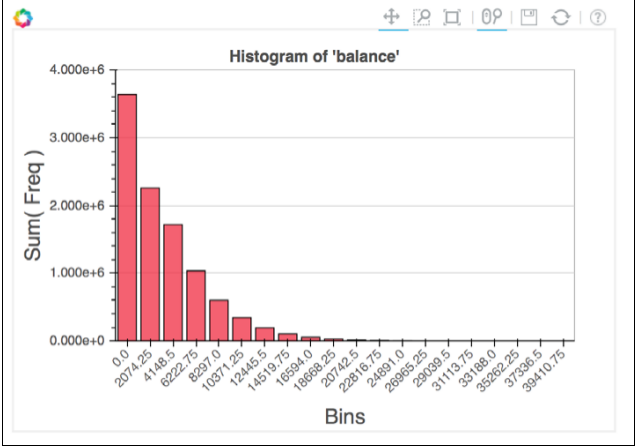
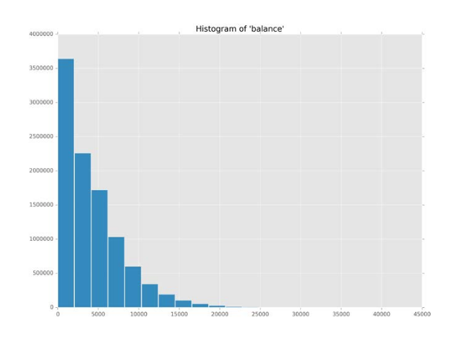
绘制频率分布直方图
matplotlib
data = {
'bins': hists[0][:-1],
'freq': hists[1]
}
plt.bar(data['bins'], data['freq'], width=2000)
plt.title('Histogram of \'balance\'')
plt.show()
输出:
bokeh
data = {
'bins': hists[0][:-1],
'freq': hists[1]
}
b_hist = chrt.Bar(
data,
values='freq', label='bins',
title='Histogram of \'balance\'')
chrt.show(b_hist)
输出: